07 / 09Brand identity & packaging
View in the portfolio4 pagesBondMax
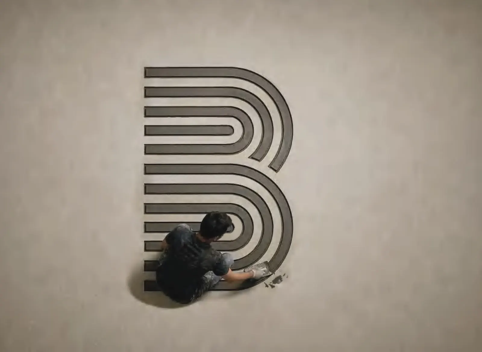
A logo found on the floor.
BondMax is a tile adhesive brand. Its logo started with an ordinary moment on a worksite and became a mark the people who use the product recognise.
- Client
- BondMax
- Sector
- Tile adhesive
- Market
- Kerala, India
- Scope
- Identity rebranding
Identity rebranding
From an adhesive mark to a brand mark.
The BondMax logo is inspired by a unique pattern that adhesive marks form on the floor. This unexpected design caught our attention: the logo emerged from an ordinary moment experienced by a worker.
By building that pattern into the logo, we created a design that feels familiar to those who work with the product, making it more meaningful and relatable. The logo is presented in Royal Blue / Deep Slate Blue, a sophisticated shade that represents trust, stability and reliability while conveying professionalism and lasting quality.
The SOAL Folio
See BondMax in our portfolio.
4 pages of the SOAL Folio cover this work. They open right here, page by page, without leaving the site.